UI of a Main Tank
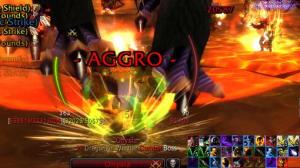
I’ve talked a little about stats and gear, I figured I’d spend a little time with addons and UIs. I recently spent a good bit of time cleaning my UI up a bit and I’m pretty proud of the way it turned out. The basic design I was going for was to have the most important parts of the UI closer to the center and the least used towards the top and sides. At the same time, I wanted comfort to play a big roll.
I’m going to detail a bit of my UI for you. First, I’ll let you in on which addons I use…First are the ones you can see in the screen shot above:
- Elkano’s BuffBars
- Prat 3.0
- Bartender4
- X-Perl Unitframes
- Cooldown Count
- Recount
- Omen
- Deadly Boss Mods
- Sexy MiniMap
- MiniMap Button Frames
- IceHUD
- Scrolling Combat Text
- SCT – Damage
Above, I’ve labeled the location of each visible add-on.
I’ll start with my buff bars.
As you can see, I have 3 columns set up. The first column shows general raid buffs. The second column shows my debuffs. These 2 columns set up automatically when you install the add-on. The third column is a custom one I created. It shows my “important” buffs or the buffs I want to keep an eye on. This column includes self cast buffs, food, flask, shouts cast by me or others and any procs I may have. In the screen shot you can see that mongoose has just proc’d. This way, while in 25 man especially, I’m not having to search through a list of 50 to 100 buffs trying to find how long my flask, shield wall or last stand has left. Having the shouts in the “self cast” bar, lets me quickly see if a fury warrior may be using commanding or battle shout. It’s also in the upper left corner, out of the way but yet there when I need it.
I have a fourth buff bar setup. This bar is scaled really big and sits in the middle of my screen. The only buff that it’ll list is when I get an instant slam while I’m dpsing. It’s by far the best warning I’ve seen to announce proc ablilities such as instant slam.
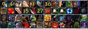
Above the buff bars I have a couple action bars set up. This is mostly none combat stuff; flask, food, hearth, professions and mounts. I do have a couple attacks up there though. I use a 9 button mouse and have these up there for special key bindings mapped to different mouse buttons. They include charge, autoattack and shoot/throw. I also have heroic throw, shield wall and last stand mapped to my mouse but they aren’t on the top bar.
Continuing on to the right top….Sexy minimap.
This is really just for looks. No real function except the coords below the clock. I just like the looks of it really. Some may argue that the square map gives a little more viewable area but it’s just a light weight addon that looks good.
Speaking of looking good. Just above and to the left of the minimap is a little bar.
If you want a good looking UI, this little gem is a must. Every add-on has it’s own minimap button. This addon takes those buttons off of the map and puts them in this little box. Right click the box and it reveals all the icons inside….”It’s a secret to everyone!” It really cleans up the UI nicely. It’s small and can be dragged anywhere and with just a right click you have access to all your add-ons.
We’ll jump to the bottom left now and talk about Prat.
I downloaded Prat out of necessity more than anything. Last year I built a new computer. It was awesome. I built it with what I could afford and upgraded as time went on. When I upgraded the video card, while the graphics were amazing (Ultra FTW), I couldn’t read the chat anymore. All text whether they were tells, general chat or guild chat, had lines through them. Prat solved that issue, guess it was something with the wow font getting corrupt? I enjoyed Prat and never tried to actually fix the problem because I though the color coded class names was sweet. I later found out that you can change that in the default UI but whatever, I like my UI and I ain’t screwing with it.
To the right of the chat window….the 1 add-on every Protection Warrior should have.
Face it, default UI just does not give you enough room to put everything close at hand like it needs to be. Enter, Bartender. This is probably the add-on I can’t live without more than any other. It gives you easy access to key binds…/kb, then mouse over the spell, esc to clear the current key bind and hit the key you’d like to assign to the spell. So easy. As you can see, my key binds are a little “odd”. I will be doing a follow up to this soon to explain them in full.
I have 4 bars cut into 2 rows. The top left bar has all my main abilities on it. The bottom left bar has lesser used abilities and need shift to modify. The top right bar is my shouts and in this screen shot my trinkets. On the bottom right bar I have my saves and heals. Notice the lack of key binds on the saves. I usually pull this bar up towards the middle of my screen during a boss fight. This allows me to click the spell I need while still keeping my left hand “home” for other abilities.
To the left of my main bars, I have recount and omen. I’m sure almost all know of these and don’t need any more explanation. I will say, yes, recount is helpful for tanks. I use it to see what kind of damage I’m taking and how hard a boss is hitting me. It also helps spot when that pesky warlock starts creeping up the treat table when his dps jumps up…lets you quickly call for a hand or intervene on him.
I really only use XPerl for it’s ability to move my frames around. Being able to see the whole raid and whose dead is helpful but I don’t use it during a fight too much. I really like the focus frame which, when used, is situated a little below and to the left of my IceHUD action bars. I didn’t have a screen shot, sorry. I usually put the off-tank or highest threat dps as focus. Off tank when we’ll be switching up on the boss, that way I can watch his de-buffs. If there’s no boss switching involved, I’ll put a mage or warlock or whoever is giving me threat issues as focus. I have intervene macro’d to /tar focus /cast intervene. Works well…if they’re in range. All in all, if I had to change 1 add-on, it’d be XPerl. I want to be able to turn off my frame and my targets frame but can’t seem to find it in the options.
If yo look to the center of the screen shot, you’ll see IceHUD. This addon gives so much info, right in the middle of your screen it’s unbelievable. First, it has my health as the green arc on the right. My target’s health just outside of that. Below those 2 arc is where the bosses buffs show up. On the left, you’ll see my rage arc and just outside of that is the bosses mana/rage/energy arc. Below the rage arc is the bosses debuffs. I love this part of the add-on, it always puts debuffs I’ve applied first, followed by all other debuffs. Very easy to see when to refresh something. Below the arc in the middle you’ll see some basic info about your target…boss/elite/level etc. Just above that, you can see the number 5….this is awesome, it tells me how many sunders are on the boss without even searching for the de-buff!
Just to the outside of IceHUD, on the left you’ll see the outgoing scrolling damage text and on the right is the incoming damage text. Makes it easy to spot a bit hit or if I crit…fun to watch all those blocks and dodges stack up too.
I hope you enjoyed a look into what I see every time I sit down to play. Hopefully, next week I’ll have a write up on keybindings and why you should use them.


January 22, 2010 at 3:06 pm
Cluttered is the first thing that comes to mind, a good portion of your screen is covered up. As a tank, you want the maximum viewable area available to you.
This is mine a few days ago, I have made a couple minor tweaks to perfect it since then and should get a new one posted on photobucket today, although in a 5 man because I’m not raiding this weekend.
The black bar on the bottom does not actually cover up the bottom of my screen, for starters, it’s a letterboxing addon that actually widens my view. Also, you’ll notice I don’t have 4 or 5 action bars full of buttons, but 1 action bar with 10 buttons, that’s because I use Spellbinder to keybind my abilties without using bars, makes things a little more convenient.
Xperl is a memory-sucker. I’d replace with Pitbull, and use Grid for your party/raid unitframes because of how compact it is.
Elk’s is an OK buff addon, but I find the list of buffs covers a large part of my screen. Instead, I use Satrina’s buff frames and have many different buff frames. There’s one for my raid buffs, in the bottom left, one for target buffs and debuffs, one for misc. buffs and auras in the top right. A large frame for my debuffs, and one in the center to show me when sword and board procs so I know when to mash shield slam.
February 6, 2010 at 1:51 am
Your UI is pretty nice, but I don’t like how everything is kind of shoved onto the screen and made to fit. It seems to kind of limit the amount of in-game things that you can see going on.
I’ve posted a couple screenshots of my UI at:
http://www.bashmyfacein.com/2010/02/how-do-you-play/
I’m using CoehlUI (http://www.wowinterface.com/downloads/info15475-CoehlUI.html) which is very nice and easy to setup.
February 6, 2010 at 11:54 am
The easy solution to the “viewable area” problem is /console command camera distance4.5…I can’t pull up the game atm but I have that macroed to set my viewable area to maximum.
I have used the “viewport” mods but none I can find actually do what they say. They all (or at least the ones I’ve found) clip the edges of the screen off. It looks cleaner but still the same problems.
I have no issues with seeing what’s going on around me and am usually the first tank to grab “stray” adds during trash pulls.